Illustrations & Design ...1 | ...2 | ...3 | ...4 | ...5
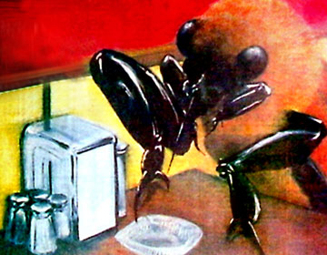
This is an early pastel illustration from the '80s. It appeared in a Toronto Star lifestyle story about people and their phobias. My favourite part was the salt and pepper shakers reflected in the napkin dispenser, but for readers, the bug may have been a little over the top, I liked the idea of exaggerating the scale of the subject to help illustrate the topic - an idea that goes back to medieval painting.
These were also early days of electronic art. I was using Adobe Illustrator 88 (A.I. vers. 2), although at The Financial Post I had version 1. It was originally a black and white vector drawing program. While at the Star I went to Boston to Adobe Systems to learn Display PostScript programming. It really helped my understanding of what was going on. Afterwards, I could do diagnostics of other peoples' files that wouldn't print. There were restrictive limits back then when it came to ripping film (rastor image processing).
I think this was my first vector magazine cover. I was also writing a regular column called MetaBytes where I revealed the secrets of smooth vector gradients, colour trapping and shading techniques. It was basically a technical column full of formulas and how-to sequences.
After this I started my own design business - Shakespeare Company. Among my favourite clients was Side Effects Software. I used to do their marketing materials and manuals. One of its founders is Greg Hermanovic. He's won two Academy Awards (for technical advances) since then. His new company is Derivative and their new application is called TouchDesigner. Check it out!
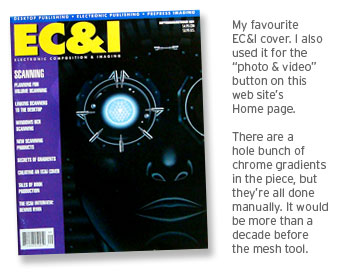
The robotic hand was always a favourite assignment. This was from the early '90s after I left The Star. There was a company that manufactured "tactile sensors" - they asked me to design a hand and gave me complete creative freedom. I spent way too long on the job for what it paid. At the time I was writing a chapter for Chris Dickman's book Mastering CorelDraw (insert). He was also the editor of EC&I Magazine (Electronic Composition & Imaging) published by Youngblood. Eventually, I became the art director of that magazine.
Chris' book was published by PeachPit and I wrote the chapter on advanced vector drawing techniques. One of the biggest thrills of my life was getting an 8-page, personal FAX from John Warnock (founder of Adobe Systems), who informed me about how and why he integrated parametric spline geometry from Pierre Bézier into his PostScript PDL (page description language).
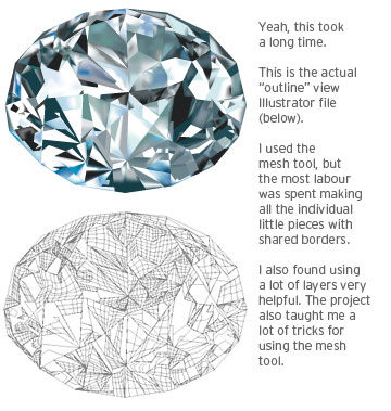
The diamond is a vector illustration. The gradient mesh tool has pushed vector art into a whole new paradigm.
NEXT >